How to Pull Salesforce Data into PowerPoint

Stacy Wu
-
June 22, 2026
-
5 mins


Salesforce is where many revenue teams track pipeline, renewals, and account health. The trouble starts at reporting time, when all of that has to leave the CRM and turn into a PowerPoint for a board update, a QBR, or a pipeline review. Salesforce runs your revenue motion well, but it does not build presentations, so a person ends up moving those numbers onto slides by hand, every cycle.
That manual export-and-rebuild loop is the real cost of getting Salesforce data into PowerPoint, and it grows as you add more accounts and audiences. This blog covers the practical ways to do it, explains what each one does well, and helps you pick the right method based on how often you build the deck.
Salesforce doesn't offer any methods of generating a finished PPT with just one click. It does offer export options, but they stop well short of a built slide:
Each of these works for part of a deck, not the whole deck. None of them refreshes on its own, and none produces editable PowerPoint charts. As soon as the report recurs, you go right back to exporting and rebuilding.
The right approach comes down to how much volume and personalization your reporting demands.
1. Export to Excel, build the chart, paste it in: Run your Salesforce report, export it to Excel, chart the data, and copy the chart into PowerPoint. You get total control with no setup, which makes this the right call for a one-off. As a recurring habit, it quietly eats hours, because every refresh means running the whole sequence again.
2. Connect Salesforce to Excel, then paste-link the charts: A connector or an Excel add-in can pull your report data into a workbook that you refresh in place. You build the charts in Excel, then use Paste Special to insert them into PowerPoint as linked objects that update when the workbook updates. This is a real step up for recurring reports. The trade-off is that linked objects break easily, they cover charts only and skip your tables and written commentary, and someone still has to run the refresh each time.
3. Route through a BI tool: You can pipe Salesforce into Tableau, Power BI, or Salesforce's own CRM Analytics, build your visuals there, and export them to PowerPoint. If your team already lives in a BI tool, this path gets you closer to current data. If your team does not, you are standing up a whole reporting layer just to make slides.
4. Use a dedicated presentation-automation tool: Presentation automation tools connect straight to Salesforce and generate the finished deck from a template. They cut out the BI layer in the middle and the copy-paste step at the end.
Recurring reports are where teams feel the friction most because content, such as a weekly pipeline review, a monthly customer health update, and a quarterly business review, all pull from Salesforce, and none of them are a one-time export. Every cycle, someone pulls fresh data, rebuilds the visuals, drops them into the template, reformats whatever shifted, and rewrites the story to match the new numbers.
CRM reporting adds a per-account problem on top of that. A QBR for one customer shows only that customer's data. So if you run QBRs for forty accounts, you build forty separate exports, forty separate decks, and forty separate chances for something to go stale or off-brand. Pipeline decks split by segment, region, or rep create the same multiplier. Manual assembly costs you more than time, because different people export at different moments and format their slides differently, which means the same story ends up looking inconsistent across the team.
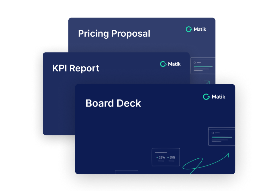
Matik automates the creation of presentations directly from your data, powered by AI you can trust. It connects to Salesforce as a data source, queries your CRM data, and generates a fully editable PowerPoint file with charts and tables already populated from your current Salesforce data. Those charts and tables come out as editable objects, not as static images saved from a dashboard.
A few specific Matik capabilities matter for Salesforce reporting:
Matik fits best when your team produces high volumes of recurring or personalized PowerPoint reports from Salesforce and the manual work is eating time you would rather spend on accounts. When your reporting stays contained and infrequent, a Salesforce export plus manual charting usually does the job.
The best method comes down to one thing: how often you build the deck, and for how many audiences. Here is the direct answer for each case:
So there is no single best way to get Salesforce data into PowerPoint. For a one-off, the native export wins on speed. For recurring or personalized reporting at scale, generating the deck directly from Salesforce saves you the most time.

Salesforce is where many revenue teams track pipeline, renewals, and account health. The trouble starts at reporting time, when all of that has to leave the CRM and turn into a PowerPoint for a board update, a QBR, or a pipeline review. Salesforce runs your revenue motion well, but it does not build presentations, so a person ends up moving those numbers onto slides by hand, every cycle.
That manual export-and-rebuild loop is the real cost of getting Salesforce data into PowerPoint, and it grows as you add more accounts and audiences. This blog covers the practical ways to do it, explains what each one does well, and helps you pick the right method based on how often you build the deck.
Salesforce doesn't offer any methods of generating a finished PPT with just one click. It does offer export options, but they stop well short of a built slide:
Each of these works for part of a deck, not the whole deck. None of them refreshes on its own, and none produces editable PowerPoint charts. As soon as the report recurs, you go right back to exporting and rebuilding.
The right approach comes down to how much volume and personalization your reporting demands.
1. Export to Excel, build the chart, paste it in: Run your Salesforce report, export it to Excel, chart the data, and copy the chart into PowerPoint. You get total control with no setup, which makes this the right call for a one-off. As a recurring habit, it quietly eats hours, because every refresh means running the whole sequence again.
2. Connect Salesforce to Excel, then paste-link the charts: A connector or an Excel add-in can pull your report data into a workbook that you refresh in place. You build the charts in Excel, then use Paste Special to insert them into PowerPoint as linked objects that update when the workbook updates. This is a real step up for recurring reports. The trade-off is that linked objects break easily, they cover charts only and skip your tables and written commentary, and someone still has to run the refresh each time.
3. Route through a BI tool: You can pipe Salesforce into Tableau, Power BI, or Salesforce's own CRM Analytics, build your visuals there, and export them to PowerPoint. If your team already lives in a BI tool, this path gets you closer to current data. If your team does not, you are standing up a whole reporting layer just to make slides.
4. Use a dedicated presentation-automation tool: Presentation automation tools connect straight to Salesforce and generate the finished deck from a template. They cut out the BI layer in the middle and the copy-paste step at the end.
Recurring reports are where teams feel the friction most because content, such as a weekly pipeline review, a monthly customer health update, and a quarterly business review, all pull from Salesforce, and none of them are a one-time export. Every cycle, someone pulls fresh data, rebuilds the visuals, drops them into the template, reformats whatever shifted, and rewrites the story to match the new numbers.
CRM reporting adds a per-account problem on top of that. A QBR for one customer shows only that customer's data. So if you run QBRs for forty accounts, you build forty separate exports, forty separate decks, and forty separate chances for something to go stale or off-brand. Pipeline decks split by segment, region, or rep create the same multiplier. Manual assembly costs you more than time, because different people export at different moments and format their slides differently, which means the same story ends up looking inconsistent across the team.
Matik automates the creation of presentations directly from your data, powered by AI you can trust. It connects to Salesforce as a data source, queries your CRM data, and generates a fully editable PowerPoint file with charts and tables already populated from your current Salesforce data. Those charts and tables come out as editable objects, not as static images saved from a dashboard.
A few specific Matik capabilities matter for Salesforce reporting:
Matik fits best when your team produces high volumes of recurring or personalized PowerPoint reports from Salesforce and the manual work is eating time you would rather spend on accounts. When your reporting stays contained and infrequent, a Salesforce export plus manual charting usually does the job.
The best method comes down to one thing: how often you build the deck, and for how many audiences. Here is the direct answer for each case:
So there is no single best way to get Salesforce data into PowerPoint. For a one-off, the native export wins on speed. For recurring or personalized reporting at scale, generating the deck directly from Salesforce saves you the most time.