How to Get Looker Data into PowerPoint

Stacy Wu
-
May 4, 2026
-
5 mins


Looker is built for data exploration. It is where your analytics team goes to build models, run queries, and answer questions about the business. PowerPoint is where the answers to those questions get shared with the people who need to act on them. Getting from one to the other is not something Looker was designed to do natively, and that gap is where most analytics and RevOps teams feel the most friction.
This blog covers what Looker offers for exporting data, what the manual PowerPoint workflow actually involves, and what approaches teams use to close that gap when volume or consistency becomes a constraint.
Unlike some BI tools, Looker does not offer a native option for exporting data to PowerPoint. What it does offer are download options for individual Looks and dashboards in formats you can work with manually. From any Look or dashboard in Looker, you can download data as a CSV, or download a visual as a PNG or PDF. Those files can be inserted into a PowerPoint deck, but the translation from a Looker export to a finished slide has to be done manually every time.
For teams producing an occasional one-off report, this is manageable. For teams producing recurring reports for multiple stakeholders, it means someone is doing that manual export repeatedly on a fixed schedule.
The manual process involves downloading the relevant Looks or dashboard tiles, inserting the images or data into a PowerPoint deck, reformatting visuals to match the slide layout and brand standards, and updating any written analysis to reflect what the current data shows. At one to two hours per report, the time cost is significant on its own.
Two specific problems compound that cost.
The first problem is audience variation. A Looker dashboard often needs to be presented differently depending on who it’s being presented to. A version of the same data for a sales leader looks different from a version for a customer. Producing multiple audience-specific versions of the same PowerPoint deck from the same Looker data means repeating the entire export and formatting process for each version.
The second is data freshness. Because Looker exports produce static files, a PowerPoint deck built from a Monday morning export reflects Monday morning data. If a stakeholder opens that deck the following week, the numbers they see are not current. For recurring reports where stakeholders expect to be working from the latest data, that gap creates credibility problems that are hard to address without rebuilding the deck from scratch each time.
Regardless of the tool or approach you use, getting a few things right in Looker upfront makes every reporting cycle faster and more consistent.
Several approaches exist depending on where the bottleneck is for your team.
AI writing tools like ChatGPT or Claude reduce the time spent on the analysis and story portions of report prep once the data is in front of you. These tools help translate Looker metrics into plain-language insights, draft executive summaries, and frame trends for a specific audience. They do not connect to Looker directly, so the data extraction step still happens manually. For teams where writing and framing is the bottleneck rather than the data work itself, they make a meaningful difference without requiring any integration.
Scheduled email delivery in Looker lets you send data to recipients on a recurring cadence as a CSV or PDF attachment. This does not produce a PowerPoint deck, but it can reduce the manual export step for teams whose stakeholders are willing to work from a formatted PDF or raw data file rather than a polished slide.
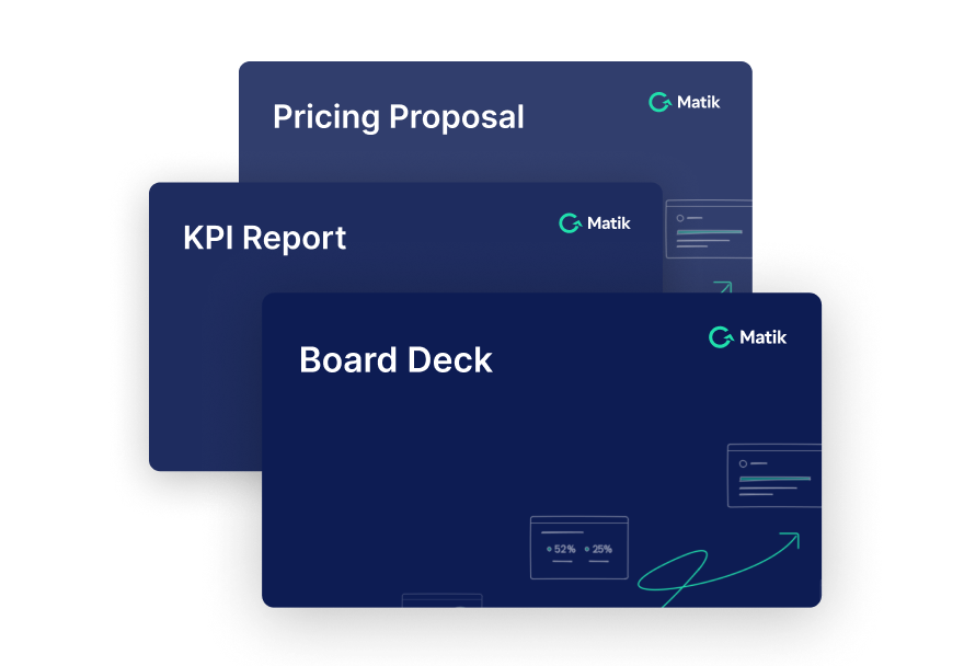
Presentation automation platforms, like Matik, address the data extraction and formatting problem more directly. Matik automates the creation of presentations directly from your data, using AI with guardrails. It connects to Looker as a data source and queries your Looks and dashboards at the moment a PowerPoint deck is generated, producing a fully editable PowerPoint file built from your existing deck structure. The charts and tables in that file are native PowerPoint objects rather than static images, which means they remain editable after generation.
Three Matik specific capabilities matter for Looker-based PowerPoint reporting:
Matik is the right fit for teams producing recurring or audience-specific PowerPoint decks from Looker at a volume where the manual export and formatting process is consuming time that should be going to analysis. If your reporting cadence is light and the audience rarely changes, the manual workflow combined with AI writing tools is often the more practical starting point.
If you work on an analytics or RevOps team, the gap between Looker and PowerPoint is probably one of those problems you have just accepted as part of the job. You build something genuinely useful in Looker, and then you spend an hour making it look right on slides, every cycle, for every audience that wants it formatted differently.
That is a solvable problem. Whether you close it with AI writing tools, a more disciplined manual process, or something that automates the translation entirely depends on how much of your week it is currently taking up. But it is worth solving, because the work that actually requires your expertise is not the formatting.

Looker is built for data exploration. It is where your analytics team goes to build models, run queries, and answer questions about the business. PowerPoint is where the answers to those questions get shared with the people who need to act on them. Getting from one to the other is not something Looker was designed to do natively, and that gap is where most analytics and RevOps teams feel the most friction.
This blog covers what Looker offers for exporting data, what the manual PowerPoint workflow actually involves, and what approaches teams use to close that gap when volume or consistency becomes a constraint.
Unlike some BI tools, Looker does not offer a native option for exporting data to PowerPoint. What it does offer are download options for individual Looks and dashboards in formats you can work with manually. From any Look or dashboard in Looker, you can download data as a CSV, or download a visual as a PNG or PDF. Those files can be inserted into a PowerPoint deck, but the translation from a Looker export to a finished slide has to be done manually every time.
For teams producing an occasional one-off report, this is manageable. For teams producing recurring reports for multiple stakeholders, it means someone is doing that manual export repeatedly on a fixed schedule.
The manual process involves downloading the relevant Looks or dashboard tiles, inserting the images or data into a PowerPoint deck, reformatting visuals to match the slide layout and brand standards, and updating any written analysis to reflect what the current data shows. At one to two hours per report, the time cost is significant on its own.
Two specific problems compound that cost.
The first problem is audience variation. A Looker dashboard often needs to be presented differently depending on who it’s being presented to. A version of the same data for a sales leader looks different from a version for a customer. Producing multiple audience-specific versions of the same PowerPoint deck from the same Looker data means repeating the entire export and formatting process for each version.
The second is data freshness. Because Looker exports produce static files, a PowerPoint deck built from a Monday morning export reflects Monday morning data. If a stakeholder opens that deck the following week, the numbers they see are not current. For recurring reports where stakeholders expect to be working from the latest data, that gap creates credibility problems that are hard to address without rebuilding the deck from scratch each time.
Regardless of the tool or approach you use, getting a few things right in Looker upfront makes every reporting cycle faster and more consistent.
Several approaches exist depending on where the bottleneck is for your team.
AI writing tools like ChatGPT or Claude reduce the time spent on the analysis and story portions of report prep once the data is in front of you. These tools help translate Looker metrics into plain-language insights, draft executive summaries, and frame trends for a specific audience. They do not connect to Looker directly, so the data extraction step still happens manually. For teams where writing and framing is the bottleneck rather than the data work itself, they make a meaningful difference without requiring any integration.
Scheduled email delivery in Looker lets you send data to recipients on a recurring cadence as a CSV or PDF attachment. This does not produce a PowerPoint deck, but it can reduce the manual export step for teams whose stakeholders are willing to work from a formatted PDF or raw data file rather than a polished slide.
Presentation automation platforms, like Matik, address the data extraction and formatting problem more directly. Matik automates the creation of presentations directly from your data, using AI with guardrails. It connects to Looker as a data source and queries your Looks and dashboards at the moment a PowerPoint deck is generated, producing a fully editable PowerPoint file built from your existing deck structure. The charts and tables in that file are native PowerPoint objects rather than static images, which means they remain editable after generation.
Three Matik specific capabilities matter for Looker-based PowerPoint reporting:
Matik is the right fit for teams producing recurring or audience-specific PowerPoint decks from Looker at a volume where the manual export and formatting process is consuming time that should be going to analysis. If your reporting cadence is light and the audience rarely changes, the manual workflow combined with AI writing tools is often the more practical starting point.
If you work on an analytics or RevOps team, the gap between Looker and PowerPoint is probably one of those problems you have just accepted as part of the job. You build something genuinely useful in Looker, and then you spend an hour making it look right on slides, every cycle, for every audience that wants it formatted differently.
That is a solvable problem. Whether you close it with AI writing tools, a more disciplined manual process, or something that automates the translation entirely depends on how much of your week it is currently taking up. But it is worth solving, because the work that actually requires your expertise is not the formatting.