Choosing the Right Data Visualization

Rachel Skroback
-
September 1, 2022
-
3 minutes

By now, you’re probably well aware that data can make or break a company’s success. In any organization, employees rely on data to measure success, determine action steps for the future, and make informed decisions. And if you work in the customer success field, you have the added responsibility of bringing meaningful data insights to the clients you serve in order to build credibility and retain their business.
But to be successful in sharing data with your customer, you need to be able to tell a story that helps them connect the dots, and visualizing the data so that it is digestible at a glance is key to that. Without taking this approach, your clients may struggle to see the value in your product or service and ultimately may take their business elsewhere.
In this blog post, you’ll learn why data visualizations are an essential tool for customer success teams that need a better way to prove the value of their product or service. We’ll also explore different types of data visualizations and explain how to identify ideal scenarios for when to utilize each one.

When it comes to data, it should come as no surprise that showing is more effective than telling. Instead of throwing a slew of numbers at your customers with no rhyme or reason, make sure to take some time to build out a data narrative first. Ask yourself: What story are you trying to tell here, and what is the best way to present it?
In many cases, a data visualization is the correct solution—but with so many options to choose from (like graphs, pie charts, tables, and more) it can be a challenge to decide the best way for your information to be presented visually.
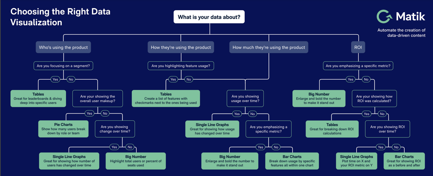
In the flow chart above, you can see that a great place to start when building a data visualization is to evaluate what your data is about. First, narrow down if your data is about:
From there, you can ask yourself additional questions to determine the most logical, effective way to build this data into a visual presentation. For example, if you’re looking for a way to represent changes over time to prove the value of a product, a line graph may be your best bet. If you’re looking for a way to present feature usage side by side for easier comparison, a table may be the best option. Ultimately, put yourself in your customer’s shoes: Is the presentation of your data clean, digestible, and insightful? If so, you’re on the right track.
---
Interested in Matik? Request a Demo

By now, you’re probably well aware that data can make or break a company’s success. In any organization, employees rely on data to measure success, determine action steps for the future, and make informed decisions. And if you work in the customer success field, you have the added responsibility of bringing meaningful data insights to the clients you serve in order to build credibility and retain their business.
But to be successful in sharing data with your customer, you need to be able to tell a story that helps them connect the dots, and visualizing the data so that it is digestible at a glance is key to that. Without taking this approach, your clients may struggle to see the value in your product or service and ultimately may take their business elsewhere.
In this blog post, you’ll learn why data visualizations are an essential tool for customer success teams that need a better way to prove the value of their product or service. We’ll also explore different types of data visualizations and explain how to identify ideal scenarios for when to utilize each one.
When it comes to data, it should come as no surprise that showing is more effective than telling. Instead of throwing a slew of numbers at your customers with no rhyme or reason, make sure to take some time to build out a data narrative first. Ask yourself: What story are you trying to tell here, and what is the best way to present it?
In many cases, a data visualization is the correct solution—but with so many options to choose from (like graphs, pie charts, tables, and more) it can be a challenge to decide the best way for your information to be presented visually.
In the flow chart above, you can see that a great place to start when building a data visualization is to evaluate what your data is about. First, narrow down if your data is about:
From there, you can ask yourself additional questions to determine the most logical, effective way to build this data into a visual presentation. For example, if you’re looking for a way to represent changes over time to prove the value of a product, a line graph may be your best bet. If you’re looking for a way to present feature usage side by side for easier comparison, a table may be the best option. Ultimately, put yourself in your customer’s shoes: Is the presentation of your data clean, digestible, and insightful? If so, you’re on the right track.
---
Interested in Matik? Request a Demo